Just above your landing page but well within view is a powerful CTA button tempting every visitor: the looming little “X“ button to close the tab.
The “X” will win most of the time. The median SaaS landing page converts 3.8% of its visitors, according to Unbounce's 2024 benchmark report, so the “X”, or its sibling the 🔙 button, takes the other 96 or so.
Everything on your landing page is there to help your own CTA outcompete that “X” button. And you can do better than the median, can’t you?
This guide shows you where your page is losing that contest, and what to fix first. In short, work in order. Check that the right buyers are arriving and that the ask suits how ready they are. Only then rework the page itself: clarity first, then proof, then friction. Save A/B tests for pages with the traffic to finish them.
Some of it covers familiar ground, because the basics are always worth repeating. Keep going past them for the sample-size math, the offer ladder and when to rebuild your page from scratch.
What a Landing Page Has to Do in the Time It Gets
A landing page sits between the ad, email or post that earned the click and the trial, demo or signup that follows it. In the SaaS customer journey, it is one short stage with one job: move the visitor a single step forward.
Think of it as a tugboat. It moves the ship to the next berth, and the voyage happens elsewhere. Direct mail had the same idea for envelopes. The envelope existed to get opened, and the landing page exists to get the next step taken.
That job comes with very little time. In Nielsen Norman Group's 2018 eyetracking research, 57% of viewing time went to the first screen of a page and 74% to the first two screens. Whatever the page needs to say has to arrive early, and each section further down has to earn its place.
What a Good Conversion Rate Looks Like for Your Ask and Channel
Most benchmark posts give one blended number. A blended number cannot tell you whether your page is the problem, because channel and ask move the rate far more. Here are the figures we trust, with what each one counts.
| Benchmark | Rate | Source and what it counts |
|---|---|---|
| SaaS landing pages, median | 3.8% | Unbounce 2024. 41,000+ pages, Unbounce customers, clicks and forms pooled |
| SaaS landing pages, top quarter | 11.6% | Unbounce 2024, same dataset |
| SaaS pages, email traffic | 16.9% | Unbounce 2024. Traffic from a company's own list |
| SaaS pages, paid search | 4.1% | Unbounce 2024 (Google 5.1%, Bing 1.9%) |
| SaaS pages, paid social | 2.9% | Unbounce 2024 |
| SaaS pages, display | 0.3% | Unbounce 2024 |
| Visitor to free trial, no card | 7.1% paid, 8.5% organic | First Page Sage, Sept 2025. 86 SaaS companies, agency client data |
| Visitor to free trial, card required | 2.2% paid, 2.5% organic | First Page Sage, same dataset |
The email row is six times the paid social row in the same dataset. Traffic temperature, meaning how much a visitor already knows and wants, outweighs most of what you can change on the page.
Some gaps matter too. No benchmark with a disclosed method exists for demo request pages, waitlist pages or traffic from cold outbound. Agency ranges for demo pages circulate widely, but their cohorts are undisclosed. Use your own past numbers as the baseline for those.
Two widely quoted numbers are worth ignoring:
- 2.35%. This is WordStream's 2014 median for Google Ads accounts, which measures ad clicks to any tracked conversion. It was never a landing page rate.
- The "Unbounce 2026" form-field figures. These trace back to an aggregator with no published method, and they count people who started a form. Unbounce did not produce them.
Find the Layer That Is Failing Before You Touch the Page
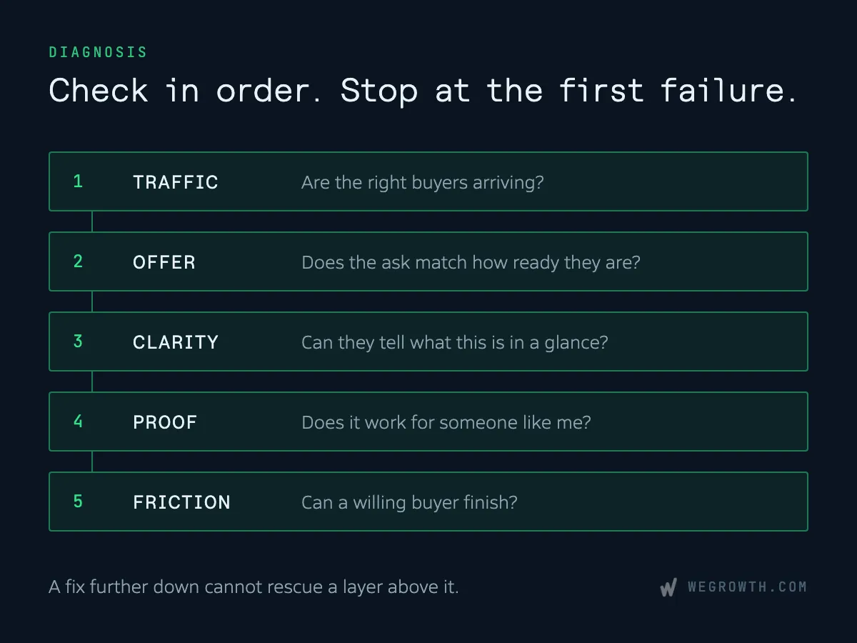
A low conversion rate is a symptom. The cause sits in one of five layers, and the order you check them in matters, because a fix to a later layer cannot rescue an earlier one. A sharper headline does nothing for visitors who were never going to buy.
- Traffic. Are the people arriving the people the page is for?
- Offer. Does the ask match how ready that traffic is?
- Clarity. Can a buyer tell what this is, who it is for and what happens next, in a glance?
- Proof. Has the page answered "does this work for someone like me" and "is this vendor real"?
- Friction. Can a willing buyer finish the form or booking without a dead end?
Check them in that order and stop at the first one that fails. The order is our recommendation, built from the diagnostic frameworks SaaS agencies publish and from founder threads where most "page" complaints traced back to traffic or the ask.
Before you change anything, spend an hour with free tools. Microsoft Clarity records sessions with no traffic limit. Look at:
- Traffic source and campaign split. Mixed traffic hides the real rate of each source.
- Scroll depth. Where does attention drop off?
- Rage clicks and dead clicks. What do visitors expect to be clickable?
- Form field abandonment. Which field do people quit on?
Conversion copywriter Ekaterina Howard offers a useful reading of those signals. High bounce with shallow scrolling points at the hero. Deep scrolling with few conversions points at the offer.
Traffic: Make Sure the Right Buyers Are Arriving
Start by splitting your conversion rate by source and campaign. A page converting at 2% overall might convert at 6% from branded search and 0.5% from a broad paid social audience. Those two numbers lead to different fixes, and only one of them involves the page. Our guide to customer acquisition channels covers which channels tend to send which kind of buyer.
Next, check message match. The ad makes a promise, and the visitor clicks to collect it. If the first screen of the page does not repeat that promise in recognisable words, the visitor has to work out whether they are in the right place. Many leave instead. Google lists consistency with the ad among its landing page experience factors for Google Ads, although nobody has published a controlled test of how much match is worth.
Vanta's on-demand demo campaign is a clean example. The Meta ad's headline reads "See Vanta in action. No sales call required."
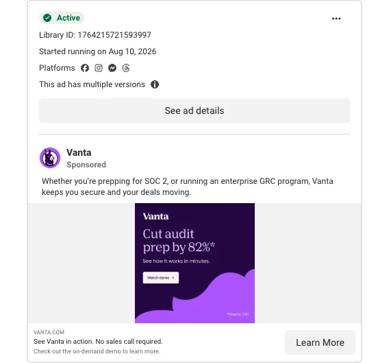
The page it links to opens with the same sentence as its headline, and the header carries only the logo.
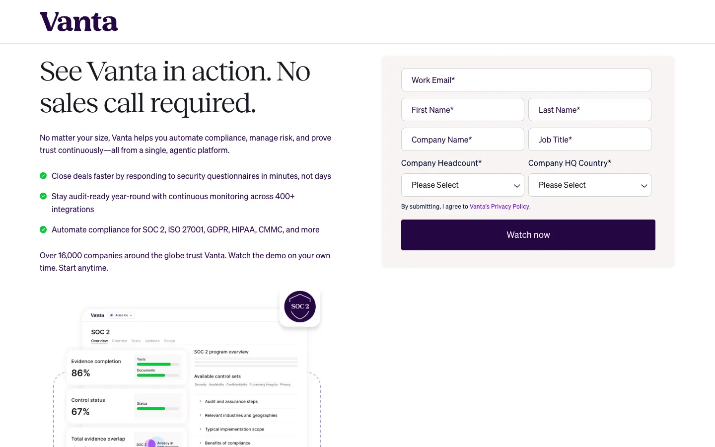
The ad's headline reappears word for word as the page's H1. The form asks for seven fields, a trade-off covered in the friction section below.
Match runs further than the hero. The form, the thank-you page and the first email should all keep the same promise. If you run paid search, our PPC service builds ad groups and pages as matched pairs for this reason.
One last traffic check: does this campaign need its own page? Sending paid traffic to a homepage makes the page serve every audience at once. A campaign aimed at one buyer with one problem usually deserves a page that speaks to that buyer and that problem.
Offer: Ask for What This Visitor Is Ready to Give
"Book a demo" is the default ask in B2B SaaS. Navattic counted the CTAs on about 5,000 B2B SaaS websites and found "Book a Demo" on 61% of them, "Try for Free" on 22% and a product tour on 18% (vendor data).
For a visitor who met you thirty seconds ago, a demo request means booking time with a salesperson. Buyers say as much. In Wynter's 2025 study of 100 B2B SaaS CMOs, 46% wanted to try the product before talking to sales.
Match the size of the ask to the temperature of the traffic:
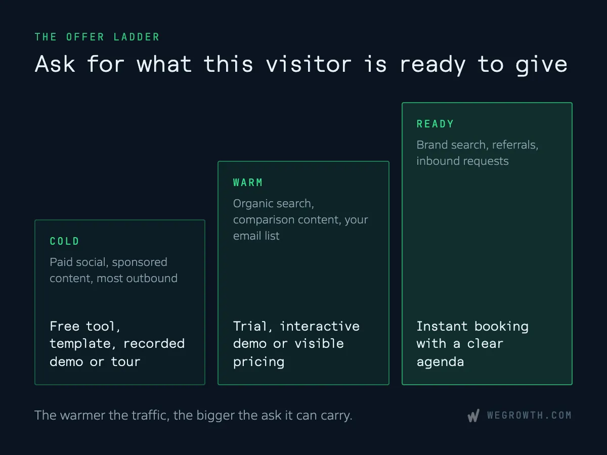
- Cold traffic (paid social, sponsored content, most outbound). A demo request tends to underperform here. Offer a free tool, an ungated template, a recorded demo or a product tour, then follow up with nurture and retargeting.
- Warm traffic (organic search, comparison content, your email list). A generic "Contact sales" tends to underperform. Offer a trial, an interactive demo, or visible pricing with a clear next step.
- Ready traffic (brand and category search, referrals, inbound). A gated asset under-asks here. Offer instant booking with a clear agenda and one or two qualifying fields.
The strongest published case for a lighter ask comes from GoCardless. The team tested "Request a demo" against "Watch a demo", which led to a 10-minute recorded video, and saw 139% more demo conversions over seven days at 95% confidence (company-reported).
You can also offer two rungs at once and let visitors choose. Storylane's paid campaign page for its AI SDR product does this. The page strips the navigation and puts "Talk to RepX," a live conversation with the product, beside "Book a demo."
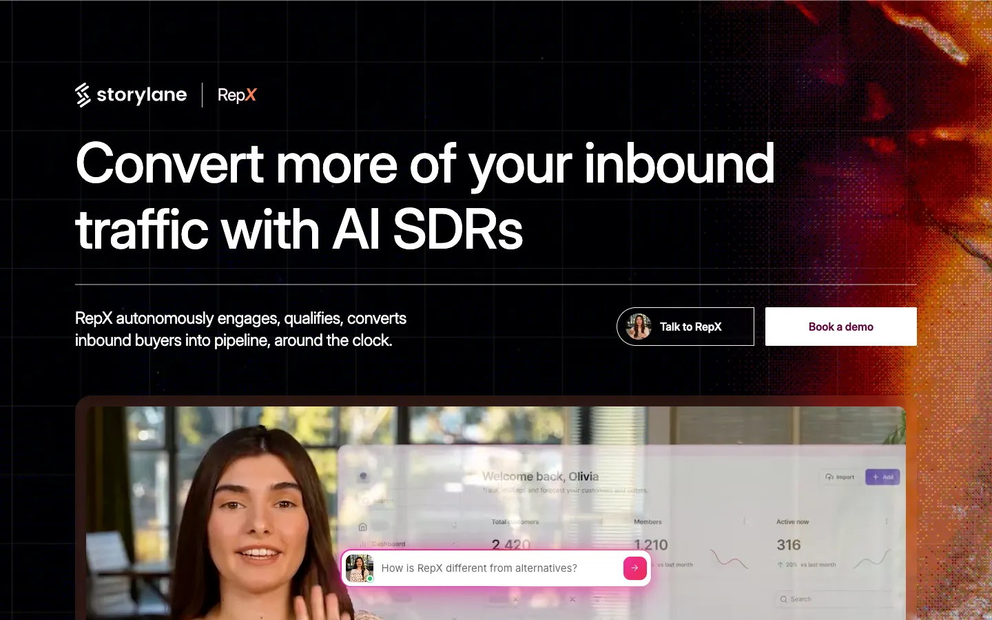
Two asks of different sizes side by side. The visitor picks the one they are ready for.
Outbound traffic deserves its own thought. No landing page benchmark exists for visitors from cold email or LinkedIn outreach. The nearest evidence is Gong's analysis of 304,174 cold emails (vendor data): on a first touch, asking about interest beat asking for a meeting. If your outbound sequence links to a page whose only ask is "Book a demo," you are making the meeting request that underperformed in the inbox. That is our inference, so test it on your own sequences.
We follow this ladder ourselves. Our customer persona generator and templates ask for very little, and our free marketing plan asks for a bit more. Neither asks a cold visitor for a sales call.
Urgency belongs to the offer too, and it gets its own section further down.
Clarity: Win the Headline Before Anything Else
David Ogilvy wrote in Confessions of an Advertising Man (1963): "On the average, five times as many people read the headline as read the body copy. When you have written your headline, you have spent eighty cents out of your dollar."
On a landing page, the hero is the headline. It decides whether the rest of the page gets read at all, which is the strongest argument for putting the offer, the outcome and the call to action above the fold.
In a glance, the hero has to answer four questions:
- What is this?
- Who is it for?
- What outcome does it deliver?
- What happens next?
Usermaven's homepage answers the first two in its headline alone.
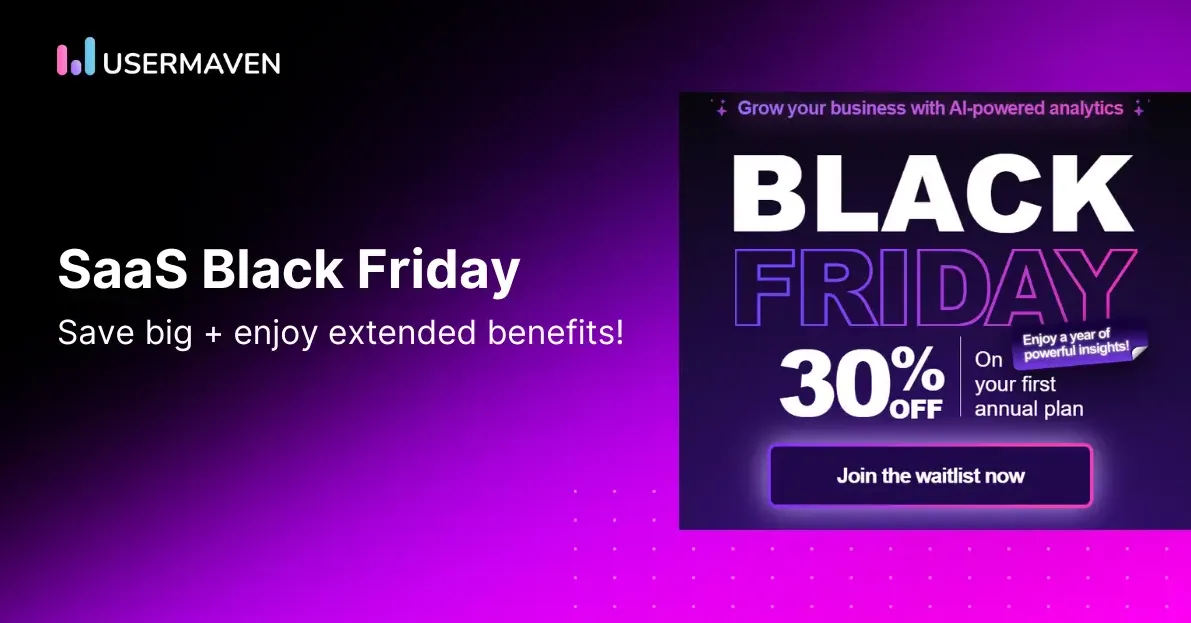
The headline names the category and the buyer. The subhead adds the outcome, and two buttons offer asks of different sizes.
The failure Wynter's CMOs described is the opposite. One said: "If I can't map their solution to my problem from the website alone, I'll skip the demo." When Indie Hackers founders roasted 200 landing pages in 2021, only one in five showed a unique selling point.
A simple before and after shows the shift:
- Before: "The all-in-one platform to [vague verb] your team's [workflow]."
- After: "[Category] for [specific buyer] that [specific outcome]."
Features or Benefits Depends on What the Reader Already Knows
The usual rule is to lead with benefits. Eugene Schwartz gave a better one in Breakthrough Advertising (1966): what you lead with depends on how aware the reader already is.
- Problem-aware buyers know the pain and not the solution. Lead with the problem, in their words.
- Solution-aware buyers know tools like yours exist. Lead with the outcome you deliver.
- Product-aware buyers know you and are comparing. Lead with the product and what makes it different.
Schwartz added a second test, market sophistication. In a crowded category, buyers have heard the plain benefit claim many times, so it carries less weight. The hero needs the mechanism, meaning how you get the result, or a sharper angle on it. If you are unsure which awareness level your traffic arrives at, our customer persona generator is a quick place to start mapping it.
Show the product itself. Peep Laja, citing Wynter's buyer testing, reports that B2B buyers want screenshots of the tool, and Nielsen Norman Group found that people attend to informative images and ignore decorative ones. Stock photos and abstract illustrations take up space without answering anything.
Body Copy: Give Each Section One Job
The hero earns the scroll. The body answers the objections the ask creates.
Most readers will not get far. Exit Five's guests reported that the average B2B reader reaches about 30% of the page. So order the sections by the questions buyers ask, in the order they ask them. A sequence that works for most B2B pages:
- The problem and the outcome
- How it works
- Proof
- Objections and FAQ
- The ask, repeated
Give each section one job and a headline that says what the section proves. Put a call to action wherever a reader might be ready to act.
How long should the page be? Copyhackers called length "a red herring," and the answer follows the ask. A demo request has more objections to answer than a free tool, so it needs a longer page.
How Original Does the Page Need to Be?
Originality matters most in the message. A familiar layout helps buyers find what they are looking for: the price, the proof, the button.
The failure is copy that could sit on a competitor's site unchanged. Wynter's CMOs named "all-in-one platform" and "unlock growth" among the phrases that got vendors cut. A quick test: swap your logo for a competitor's. If the page still reads as true, the message needs work. A template look costs trust mainly when the page also lacks specifics.
Proof: Answer "Does This Work for Someone Like Me?"
Robert Cialdini's principle of social proof, from Influence, explains why proof works. When people are unsure, they look at what others did, and they weigh most heavily the others who resemble them. On a B2B landing page, that means proof from buyers in the reader's role, company size and industry.
A testimonial that carries weight has five parts:
- A named person
- Their title and company
- The situation before
- What changed
- A specific result
Structured like this: "Before [product], our [team] spent [time] on [task]. Now [specific result]." [Name], [Title] at [Company].
B2B buyers check whether proof is real. Exit Five found that adding LinkedIn profiles to testimonials made them far more believable to technical buyers who doubted they were real. Fake or borrowed logos and walls of review badges have the opposite effect.
Proof also covers the vendor. Buyers want to know the price is reasonable, the product connects to their stack and the company is safe to buy from. Put integration and security information where buyers look for it, and use the FAQ to answer objections.
Pricing is the hardest call. HockeyStack's study of 80 B2B SaaS companies (vendor data) found that showing pricing lowered form conversion from 4.6% to 2.8% and raised submit-to-pipeline from 10.3% to 17.5%. Adam Goyette tested full pricing on his own page (self-reported): leads fell 8.7%, lead-to-opportunity rose 21.4%, and pipeline stayed flat. The likely reading is that visible pricing screens out some buyers who were unlikely to close.
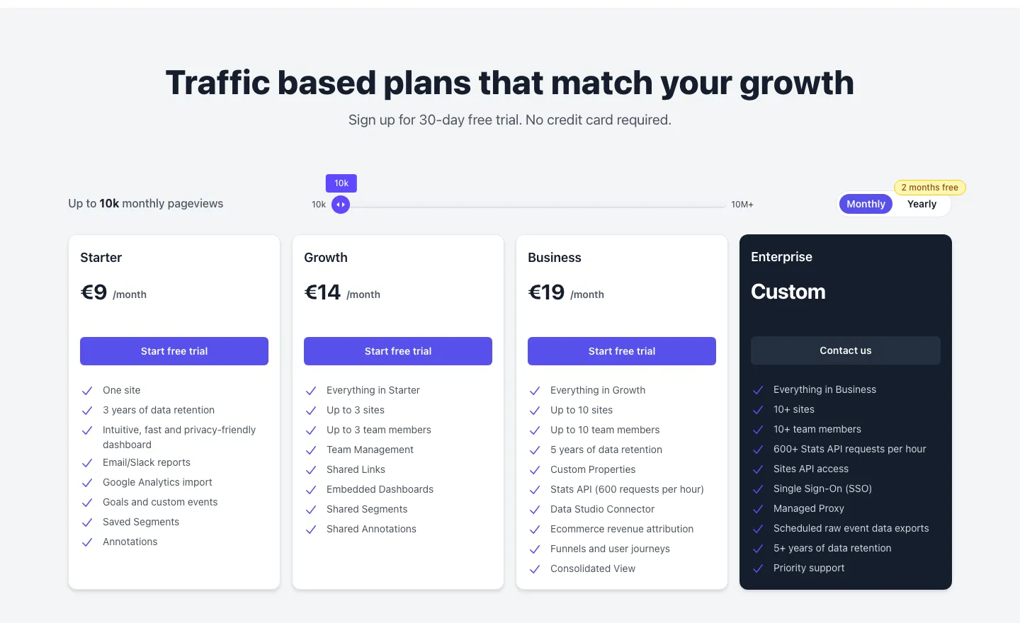
Plausible lists every plan's price on its homepage, with the trial terms directly under the heading.
In one of our engagements, for an enterprise financial automation platform, the landing pages combined outcome-based positioning, social proof and integration compatibility badges. Buyers there judged software on whether it fit their existing stack, so the badges answered their first question. The localized pages drew more than 30,000 qualified ICP buyers. Read the case study.
What to Show When You Have No Customers Yet
Early on, you may have no testimonials to show. Use proof that does not need customers:
- The founder's relevant experience, stated specifically
- A live product demo or ungated tour
- Transparent pricing
- A specific "how it works" section
- Early users or design partners quoted by name, with their permission
Then make the offer lower-risk with trial terms, cancellation terms and plain answers about setup. Replace claims with specifics: what the product does, for whom, in what setup. Leave out borrowed logos and invented quotes.
Friction: Clear the Path for Buyers Who Want to Act
"Shorter forms convert better" is half right. In a test reported by CXL, Michael Aagaard cut a nine-field form to six and conversions dropped 14%, because he had removed fields people wanted to fill. Keeping all nine and rewriting the labels lifted conversions 19.2%. Relevance matters more than count.
Qualifying fields are a pipeline decision. In a case discussed on the Exit Five podcast, an open calendar produced 200 bookings against 8 with it closed. The team then added a field asking for a project description, so sales could filter. Fewer fields bring more fills, and qualifying fields protect sales time. No study puts a number on that trade, so judge the form by the pipeline it produces.
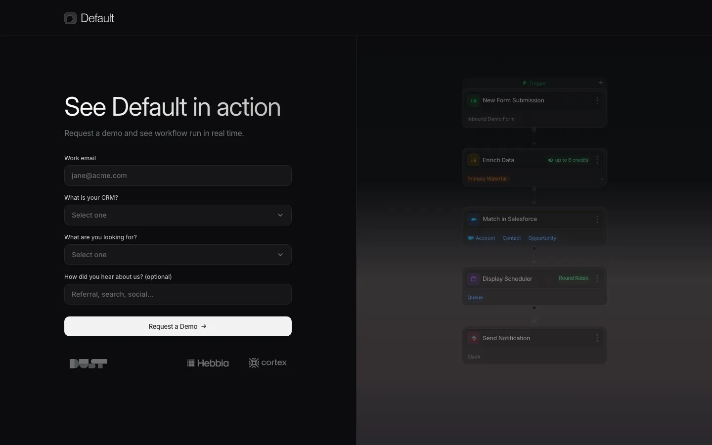
Default's demo page shows a short form where the extra fields earn their place.
Work email, two qualifying questions about the buyer's CRM and needs, and an optional field for how they heard about the company.
The other big friction point comes after the form. Chili Piper's analysis of about 4 million form submissions (vendor data) found that 30% of form fills booked a meeting without instant scheduling, against 66.7% with it. Chili Piper's own guidance is form first, calendar right after submit, so a visitor who drops off still leaves contact details.
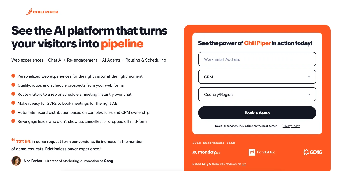
Three fields, "Pick a time on the next screen," no site navigation, and a named testimonial with a specific result beside the form.
In our work with a vertical B2B SaaS company, booking flows were part of the website fixes, alongside redesigned homepage messaging. Over the engagement, monthly ICP-qualified demo volume grew 300%. Read the case study.
Navigation is a friction question with no settled answer. Classic CRO practice removes it. B2B practitioners on Exit Five argue that buyers want to verify the vendor and leave if they feel trapped. A light header with in-page links to pricing, FAQ and security is a reasonable middle ground on paid pages.
Urgency: Give Buyers a Reason to Act Now
"Delay is the death of the sale," Gary Halbert wrote. A visitor who means to come back later often does not, and that is our practitioner judgment, since no study puts a figure on it.
The honest fixes are on the page:
- A reason to act now that is true
- A next step that is easy to take today
- A clear statement of what happens after the click
Real deadlines are fair to state when they exist: a cohort start date, a price change, limited onboarding slots.
Countdown timers and invented scarcity are another matter. There is no B2B evidence for them, and the one controlled study we found, Luguri and Strahilevitz in the Journal of Legal Analysis (2021), found countdown timers did not significantly increase purchases. Committee buyers also notice when a deadline resets.
How to Validate Changes Without Enough Traffic to A/B Test
Most advice ends with "test it." At early-stage traffic, the arithmetic rules that out for all but the biggest changes.
Using Evan Miller's sample size calculator with a 3% baseline conversion rate, 95% confidence and 80% power, each variant needs:
- 51,487 visitors to detect a 10% relative lift
- 13,051 visitors to detect a 20% lift
- 2,171 visitors to detect a 50% lift
Split traffic 50/50 and the time to finish looks like this:
| Monthly visitors to the page | Time to detect a 50% lift | Time to detect a 20% lift |
|---|---|---|
| 500 | about 8.7 months | about 52 months |
| 1,000 | about 4.3 months | about 26 months |
| 2,000 | about 2.2 months | about 13 months |
| 5,000 | about 4 weeks | about 5.2 months |
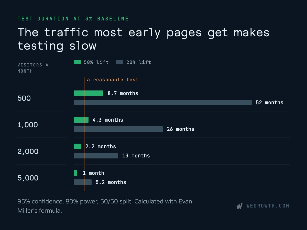
Halving the lift you want to detect roughly quadruples the traffic you need. A button color change is unlikely to reach significance at these levels. Demand Curve puts its impact at around 2% at best.
Here is what to do instead:
- Research before shipping. Test your message with buyers who match your ICP, through a panel such as Wynter or five customer interviews. Mine sales calls and support tickets for the words buyers use.
- Watch real sessions. Recordings and scroll maps show where buyers stall.
- Make bigger changes. CXL recommends aiming for "a 30%, 50% or 150% lift," and Conversion Rate Experts advise to "test the biggest, boldest ideas." Rewrite the hero or change the offer.
- Measure an earlier event. Demand Curve suggests optimizing for an event that fires at least 50 times a week, such as a CTA click or an email entry.
- Run disciplined before-and-after comparisons. Change one thing, compare equal periods with traffic sources held steady, and write down the result. Seasonality and traffic mix limit what this can prove, so read the result as directional.
Practitioners disagree about lowering the confidence bar. Jonny Longden argues it is a pragmatic choice for short-term decisions. Ron Kohavi warns it produces "25%-65% error rates on statistically significant results," and that radical ideas fail more often. Both sides agree on research first and bigger swings, and so do we. Do not call a winner from a test that was never powered to find one.
When the arithmetic says a test can finish in a few months, A/B testing becomes worth setting up. PostHog, GrowthBook and Statsig all have free tiers. Google Optimize, still recommended in many older guides, shut down on September 30, 2023.
When to Rebuild the Page Instead of Tuning It
The one published rule we know of comes from CXL (December 2014). Rebuild when:
- you have hit a local maximum after a lot of optimization
- the technology is badly outdated
- the design is amateur
- "there's very little traffic, and conversion analysis reveals so many problems"
Iterate when the design is good enough with no major technical issues, returning visitors are used to the current page, and "you have enough traffic to run tests in a reasonable time (at least 1 test / month)."
Conversion Rate Experts' current guidance points the same way: "If the calculator shows that all your tests will take months to conclude, we recommend you only user-test ideas."
For most early-stage SaaS pages, low traffic and several visible problems make a researched rebuild the faster path. Small iterations suit pages with the traffic to measure them. If you are weighing a rebuild, our SaaS web design team handles landing page builds and conversion work.
Landing Page Audit Checklist
Traffic
- Conversion rate is split by source and campaign.
- The page's first screen repeats the ad's promise.
- The form, thank-you page and first email keep the same promise.
- Each major campaign has its own page.
Offer
- The ask matches the temperature of the traffic.
- Cold traffic has a lighter ask available.
- The button says what happens after the click.
- Any deadline on the page is real.
Clarity and body copy
- The hero says what it is, who it is for, the outcome and the next step.
- The hero leads with what this traffic already knows.
- Visuals show the product.
- Each section has one job, in the order buyers ask.
Proof
- Testimonials name a person, a title, a company and a result.
- Proof comes from buyers like the reader.
- Pricing, integrations and security are easy to find.
- No borrowed logos or badge walls.
Friction
- Every form field earns its place.
- Booking follows the form immediately.
- Navigation lets buyers check pricing and FAQ without leaving.
- The page loads quickly on mobile.
Turn Conversion Gains Into Lower CAC
With spend and later funnel rates unchanged, a higher landing page conversion rate means more customers for the same budget. That makes it one of the most direct levers on customer acquisition cost, and it feeds straight into payback and LTV:CAC, as our guide to SaaS unit economics shows. Our SaaS growth calculator lets you see what a higher rate is worth at your numbers, and our metrics guide covers how to track it.
If you want help working through the order on your own pages, our free B2B SaaS marketing plan sets out 90 days of strategies for customer acquisition, landing page conversion, onboarding and ad campaigns. Get your free marketing plan.